I once spent 45 minutes trying to match a blue. Not just any blue — the exact blue from a client's logo that they'd sent as a low-resolution JPEG with no brand guidelines, no hex code, no Pantone reference, and a helpful description of "you know, that blue." I was sampling pixels, adjusting hue sliders, squinting at my screen, and still couldn't get it right because the JPEG compression had shifted the colour.
If I'd had a proper colour picker tool that day, I'd have extracted the exact hex code in two seconds, converted it to RGB, HSL, and CMYK, and moved on with my life. Instead, I learned the hard way that colour is more complicated than it looks — and that having the right tools makes all the difference.
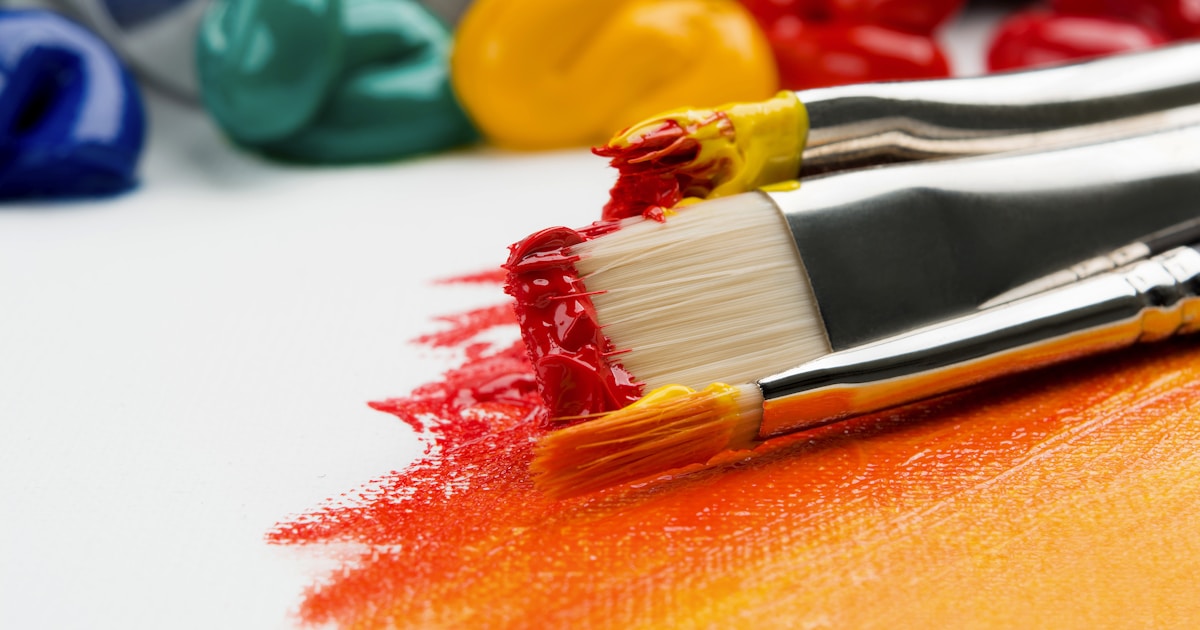
Our free color picker lets you select any colour visually, enter hex codes, RGB values, or HSL values, convert between formats instantly, and copy the exact code you need for web design, graphic design, or any creative project.
Why Colour Codes Matter
Every colour you see on a screen is defined by a numerical code. The same red can be expressed as:
| Format | Value | Used In |
|---|---|---|
| Hex | #FF0000 | Web design, CSS, HTML |
| RGB | rgb(255, 0, 0) | CSS, digital design, screens |
| HSL | hsl(0, 100%, 50%) | CSS, colour theory, design tools |
| CMYK | 0, 100, 100, 0 | Print design, commercial printing |
| Pantone | PMS 185 C | Brand guidelines, professional printing |
They all describe the same colour, but different contexts require different formats. A web developer needs hex or RGB. A print designer needs CMYK. A brand manager needs Pantone. Our color picker converts between all digital formats instantly.
Understanding Hex Colour Codes
Hex codes are the most common colour format on the web. Every hex code starts with # followed by six characters (0-9 and A-F):
#RRGGBB — two characters each for Red, Green, and Blue
- #FF0000 — maximum red, no green, no blue = pure red
- #00FF00 — no red, maximum green, no blue = pure green
- #0000FF — no red, no green, maximum blue = pure blue
- #FFFFFF — maximum everything = white
- #000000 — nothing = black
- #808080 — equal mid-values = grey
Each pair ranges from 00 (0 in decimal, none of that colour) to FF (255 in decimal, maximum of that colour). That gives 256 × 256 × 256 = 16,777,216 possible colours.
Shorthand Hex Codes
When both characters in each pair are the same, you can use shorthand:
- #FF0000 → #F00
- #336699 → #369
- #FFFFFF → #FFF
- #000000 → #000
CSS accepts both formats. Shorthand is common in code for brevity.
Understanding RGB
RGB stands for Red, Green, Blue — the three colours of light that screens use to create every colour you see. Each value ranges from 0 to 255:
- rgb(255, 0, 0) — pure red
- rgb(0, 255, 0) — pure green
- rgb(0, 0, 255) — pure blue
- rgb(255, 255, 0) — red + green = yellow
- rgb(255, 0, 255) — red + blue = magenta
- rgb(0, 255, 255) — green + blue = cyan
- rgb(128, 128, 128) — equal mid-values = grey
RGB is an additive colour model — adding more light makes colours brighter. All three at maximum = white. All three at zero = black. This is the opposite of paint, where mixing everything together makes brown or black.
RGBA — Adding Transparency
RGBA adds an alpha channel for transparency, ranging from 0 (fully transparent) to 1 (fully opaque):
- rgba(255, 0, 0, 1) — solid red
- rgba(255, 0, 0, 0.5) — 50% transparent red
- rgba(255, 0, 0, 0) — fully transparent (invisible)
This is incredibly useful in web design for overlays, shadows, and layered effects.
Understanding HSL
HSL stands for Hue, Saturation, Lightness — and it's the most intuitive colour model for humans because it describes colour the way we actually think about it:
- Hue (0-360°) — the colour itself, as a position on the colour wheel. 0° = red, 120° = green, 240° = blue
- Saturation (0-100%) — how vivid the colour is. 100% = pure colour, 0% = grey
- Lightness (0-100%) — how light or dark. 0% = black, 50% = pure colour, 100% = white
Why HSL is brilliant for designers:
- Want a darker version of your blue? Keep hue and saturation the same, reduce lightness
- Want a muted version? Keep hue and lightness, reduce saturation
- Want a completely different colour with the same feel? Change hue, keep saturation and lightness
This makes creating colour palettes much more intuitive than adjusting RGB values.
CMYK — For Print Design
CMYK stands for Cyan, Magenta, Yellow, Key (Black). It's a subtractive colour model used in printing — ink absorbs light rather than emitting it.
Important: colours on screen (RGB) and colours in print (CMYK) don't match perfectly. A vibrant neon green on your monitor might look dull and muddy when printed. This is called the colour gamut difference, and it's why professional designers always proof colours in the target medium.
Our color picker focuses on digital colour formats (hex, RGB, HSL) since it's a web tool. For print work, always consult a Pantone swatch book or request a physical proof.
Colour Theory Basics
Understanding colour relationships helps you create better designs, presentations, and websites:
The Colour Wheel
The colour wheel arranges hues in a circle. Primary colours (red, blue, yellow in traditional theory; red, green, blue in light) are evenly spaced, with secondary and tertiary colours between them.
Colour Harmonies
| Harmony | Description | Example | Feel |
|---|---|---|---|
| Complementary | Opposite on the wheel | Blue + Orange | High contrast, energetic |
| Analogous | Adjacent on the wheel | Blue + Teal + Green | Harmonious, calm |
| Triadic | Three evenly spaced | Red + Yellow + Blue | Vibrant, balanced |
| Split-complementary | One colour + two adjacent to its complement | Blue + Yellow-Orange + Red-Orange | Contrast with less tension |
| Monochromatic | One hue, different shades | Light blue + Blue + Dark blue | Elegant, cohesive |
Our color picker helps you find exact codes for any colour in your chosen harmony.
Colour Psychology
Colours trigger emotional and psychological responses. This isn't just design theory — it's backed by research and used extensively in marketing, branding, and UX design:
| Colour | Associations | Used By |
|---|---|---|
| Red | Energy, urgency, passion, danger | Coca-Cola, YouTube, Netflix, sale signs |
| Blue | Trust, calm, professionalism, reliability | Facebook, Twitter, NHS, Barclays, Samsung |
| Green | Nature, health, growth, money | Spotify, Starbucks, WhatsApp, BP |
| Yellow | Optimism, warmth, attention, caution | McDonald's, IKEA, Snapchat, warning signs |
| Orange | Creativity, enthusiasm, affordability | Amazon, EasyJet, Fanta, Sainsbury's |
| Purple | Luxury, creativity, wisdom, royalty | Cadbury, Twitch, Hallmark |
| Black | Sophistication, luxury, power, elegance | Chanel, Nike, Apple, Uber |
| White | Cleanliness, simplicity, purity, space | Apple, Google, minimalist brands |
| Pink | Femininity, playfulness, romance | Barbie, T-Mobile, Victoria's Secret |
Notice how almost every major bank uses blue? That's not coincidence — blue communicates trust and stability, exactly what you want from a financial institution.
Colour in Web Design
CSS Colour Properties
In CSS, you can use any colour format:
/* All of these produce the same blue */
color: #3498db;
color: rgb(52, 152, 219);
color: hsl(204, 78%, 53%);
color: rgba(52, 152, 219, 0.8); /* with transparency */

/* Named colours (147 built-in) */
color: cornflowerblue;
color: tomato;
color: rebeccapurple;
CSS has 147 named colours, from "aliceblue" to "yellowgreen". Some have interesting backstories — "rebeccapurple" (#663399) was added to CSS in 2014 in memory of Rebecca Meyer, the daughter of CSS pioneer Eric Meyer, who died of brain cancer at age six.
Accessibility and Colour Contrast
This is critically important and often overlooked. The Web Content Accessibility Guidelines (WCAG) require minimum contrast ratios between text and background:
| Level | Normal Text | Large Text |
|---|---|---|
| AA (minimum) | 4.5:1 | 3:1 |
| AAA (enhanced) | 7:1 | 4.5:1 |
Light grey text on a white background might look elegant, but if the contrast ratio is below 4.5:1, it's inaccessible to people with visual impairments — and it's also harder to read for everyone in bright sunlight or on low-quality screens.
Common accessibility failures:
- Light grey text on white (#999 on #FFF = 2.85:1 — FAILS)
- Red text on green background (colour-blind users can't distinguish)
- Blue links on dark blue background
- Yellow text on white background
About 8% of men and 0.5% of women have some form of colour vision deficiency. Design for them too.
Dark Mode Colours
Dark mode has become standard. But you can't just invert colours — white text on pure black (#FFF on #000) creates too much contrast and causes eye strain. Best practices:
- Use off-white text (#E0E0E0 or #D4D4D4) instead of pure white
- Use dark grey backgrounds (#1A1A1A or #121212) instead of pure black
- Reduce saturation of accent colours — vivid colours on dark backgrounds vibrate visually
- Maintain the same contrast ratios as light mode
Popular Colour Palettes for 2025
Colour trends in design shift annually. For 2025:
- Pantone Colour of the Year 2025: Mocha Mousse (17-1230) — a warm, earthy brown that reflects comfort and indulgence
- Digital lavender — soft purple tones continue from 2024, reflecting wellness and calm
- Cyber lime — bright yellow-green for tech and gaming brands
- Quiet luxury — muted tones: beige, taupe, sage, dusty rose. Less is more
- Neo mint — fresh, futuristic green with blue undertones
- Warm earth tones — terracotta, rust, ochre, clay. Natural and grounding
Extracting Colours from Images
One of the most common colour picker uses — you have an image and need the exact colour code from it. Methods:
- Our color picker — use the color picker tool to select colours visually and get hex, RGB, and HSL codes
- Browser developer tools — right-click → Inspect → find the colour property → click the colour swatch to open the browser's built-in picker
- Screenshot + picker — take a screenshot, open it in any image editor, use the eyedropper tool
- Design tools — Figma, Canva, Photoshop all have eyedropper tools
Brand Colour Codes
For reference, here are the exact hex codes of major brands (useful when designing alongside established brands):
| Brand | Primary Colour | Hex Code |
|---|---|---|
| Blue | #1877F2 | |
| Twitter/X | Black | #000000 |
| Gradient (pink-purple) | #E4405F to #833AB4 | |
| YouTube | Red | #FF0000 |
| Blue | #0A66C2 | |
| Spotify | Green | #1DB954 |
| Netflix | Red | #E50914 |
| Amazon | Orange | #FF9900 |
| Google Blue | Blue | #4285F4 |
| NHS | Blue | #005EB8 |
Colour Conversion Formulas
For the technically curious, here's how conversions work:
Hex to RGB
Split the hex code into three pairs and convert each from hexadecimal to decimal:
#3498DB → 34 = 52, 98 = 152, DB = 219 → rgb(52, 152, 219)
RGB to HSL
This involves normalising RGB values to 0-1, finding the maximum and minimum, calculating hue based on which channel is dominant, saturation from the range, and lightness from the average of max and min. It's complex maths — which is exactly why our color picker does it for you instantly.
Other Useful Design and Creative Tools
- QR Code Generator — create QR codes with custom colours
- Word Counter — check content length for web pages
- Percentage Calculator — calculate colour opacity percentages
- Invoice Generator — create professional branded invoices
Try Our Free Color Picker
Whether you're a web developer needing hex codes, a designer matching brand colours, a student learning colour theory, or anyone who needs to find the exact code for a colour — our free color picker gives you instant conversions between hex, RGB, and HSL. Visual selection, manual input, and one-click copy. Completely free, no sign-up required.
Frequently Asked Questions
What is a hex colour code?
A hex colour code is a six-character code starting with # that defines a colour using hexadecimal values for red, green, and blue. For example, #FF0000 is pure red. There are 16.7 million possible hex colours.
What is the difference between RGB and hex?
They represent the same colours in different formats. RGB uses decimal numbers 0-255 for each channel (e.g., rgb(255, 0, 0)). Hex uses hexadecimal 00-FF (e.g., #FF0000). They're interchangeable — our color picker converts between them instantly.
What is HSL and when should I use it?
HSL (Hue, Saturation, Lightness) describes colour in a way that's intuitive for humans. Use it when you want to create variations of a colour — darker, lighter, or more muted versions — without changing the base hue. It's especially useful for creating colour palettes.
How do I find the colour code from an image?
Use our color picker to select colours visually, or use the eyedropper tool in any image editor (Photoshop, Figma, Canva, or even the built-in tools in Chrome DevTools).
Why do colours look different on screen vs print?
Screens use RGB (additive light), while printers use CMYK (subtractive ink). The colour gamuts don't overlap perfectly — some screen colours can't be reproduced in print and vice versa. Always proof printed materials before a full print run.
What is colour accessibility?
Colour accessibility ensures that content is readable and usable by people with visual impairments, including colour blindness. WCAG guidelines require minimum contrast ratios of 4.5:1 for normal text and 3:1 for large text. About 8% of men have some form of colour vision deficiency.
Comments
No comments yet. Be the first to comment!
Leave a Comment